
Project type :
Evaluative redesign Existing product, improvement Mapping full platform journey
CLIENT:
TiriVelo
YEAR:
2026
EXPERIENCE:
End-to-End Product Design, Complex UX Problem-Solving

TiriVelo Web Redesign
about.
This capstone project focused on redesigning the web experience for a pet service marketplace that connects pet owners with independent pet care providers. We partnered with a real client, giving our team the opportunity to work directly with stakeholders, understand real business goals, and incorporate feedback throughout the design process. Although the company already had an established mobile product, the web platform consisted of disconnected screens that did not support complete user journeys.
As part of a collaborative design team, I worked closely with my teammates to research user needs, identify usability issues, and develop design solutions that aligned with both user and business objectives. My role focused on evaluating the existing experience and redesigning the web platform into a cohesive, desktop-first product that complemented the mobile experience while supporting future business growth.


challenge.
Constraints
Existing mobile product served as the source of truth
Existing design system had to be reused
Designs needed to support engineering handoff
Limited access to real platform users
Discovering Where Users Lost Confidence
Before redesigning the interface, I evaluated the current experience to understand where users encountered friction.
Research Activities
Compared existing web and mobile workflows
Created journey maps for pet owners and providers
Conducted heuristic evaluations
Performed competitive analysis of Rover and Wag
Interviewed a representative provider user

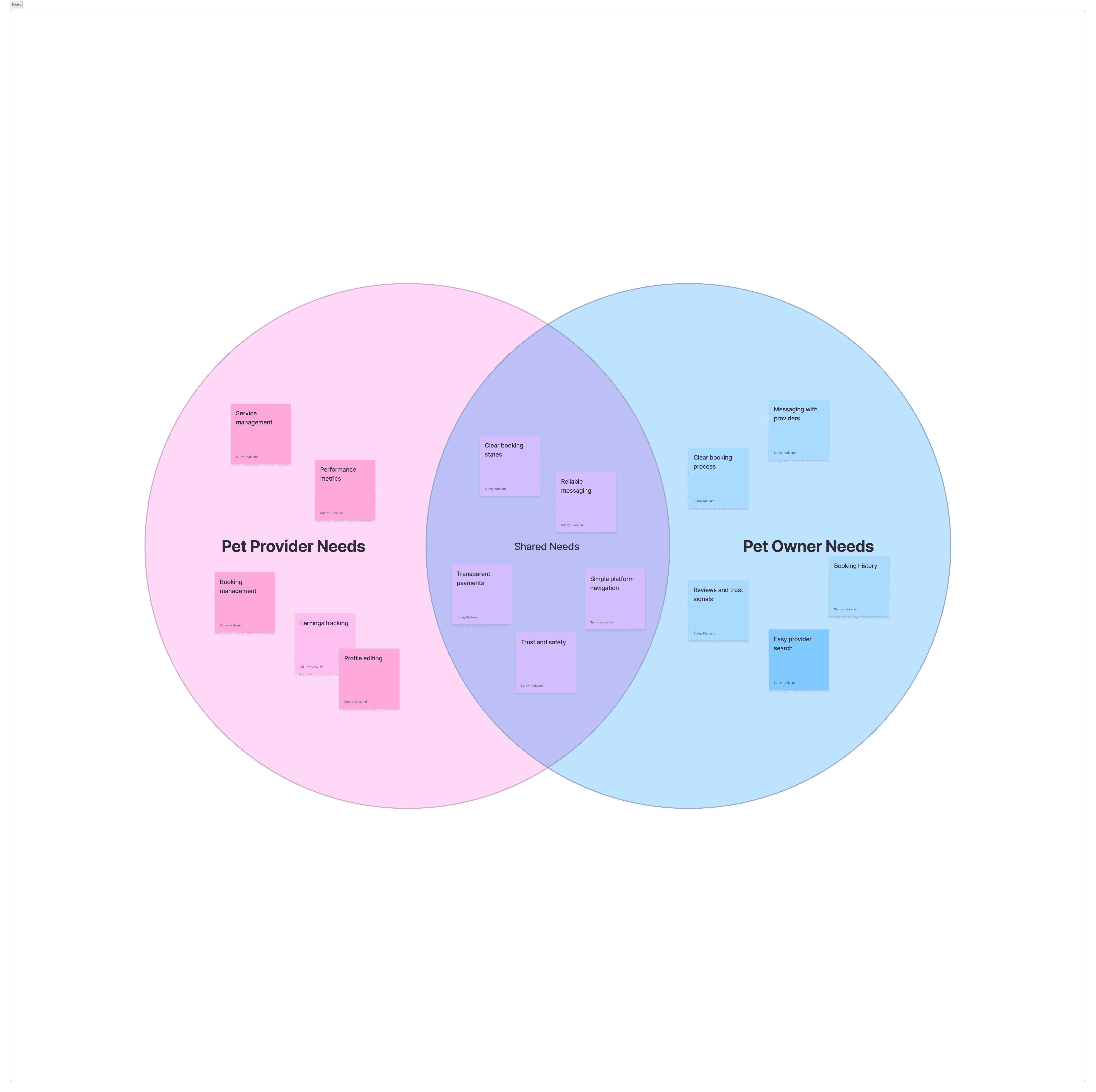
Inconsistent Experience
The website no longer aligned with the mobile experience, creating inconsistencies in navigation, layouts, and user expectations across platforms.
Low User Confidence
Heuristic evaluations and journey mapping revealed moments where users lacked clear feedback and guidance, reducing confidence during key tasks.
Outdated Interface
The existing interface relied on older patterns that made important actions less intuitive and increased the effort required to complete common workflows.
Competitive Gap
Compared with competitors like Rover and Wag, the website lacked modern usability patterns, making the overall experience feel less efficient and engaging.
user research
Participant Interview
I interviewed David Ramirez, a freelance dog walker who uses multiple pet service platforms to manage bookings and communicate with clients.
David shared that he relies on these platforms to:
Track bookings and earnings
Manage availability
Communicate with pet owners
Build credibility through reviews
He also described several pain points:
Difficulty tracking bookings across multiple days
Cluttered dashboard layouts
Limited control over availability settings
His feedback reinforced several issues identified during the heuristic evaluation and helped prioritize the dashboard redesign.

Design Focus
Provider Dashboard
After identifying platform-wide usability issues, I focused on redesigning the provider dashboard—the primary workspace providers use to manage their business.
Because providers rely on this screen every day, improving its usability offered the greatest opportunity to reduce friction, simplify daily workflows, and surface the most important information at a glance.
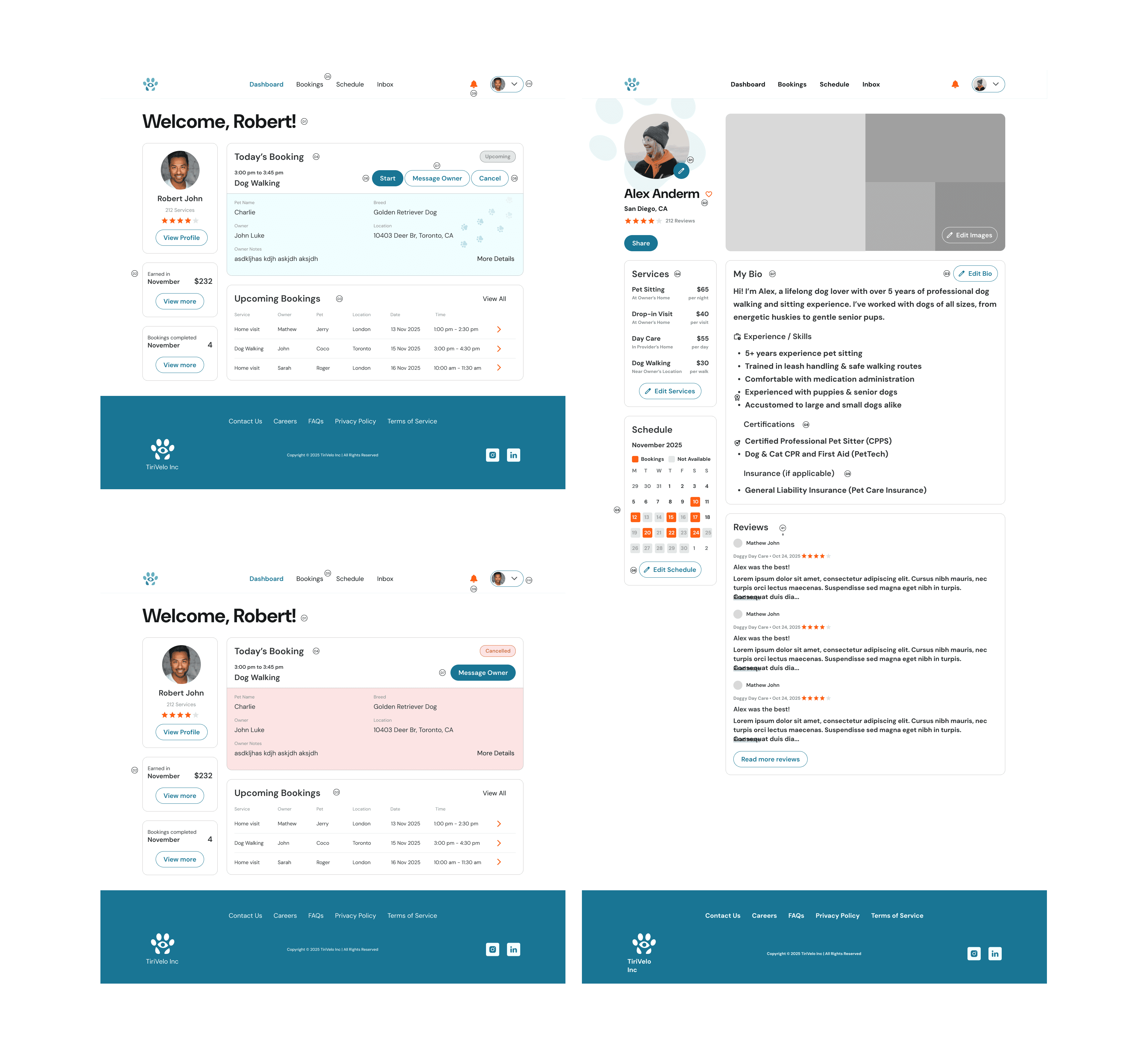
Design Exploration
Key Design Decisions
The redesign focused on making the dashboard easier to scan while improving access to the tools providers use most often.
Key improvements included:
Prioritizing monthly earnings and booking summaries
Simplifying the dashboard hierarchy
Redesigning availability management
Adding performance metrics and review summaries
Improving navigation between Bookings, Calendar, and Payouts
Building reusable components within the existing design system
From Wireframes to Final UI
The dashboard evolved through several iterations, each focused on improving clarity and usability.
Low-Fidelity
Established information hierarchy
Explored layout options
Tested navigation structure
Mid-Fidelity
Refined component placement
Improved content organization
Defined interaction patterns
Final UI
The final dashboard surfaces key business insights while keeping the interface organized, efficient, and easy to navigate.

Usability Testing
Objective
Evaluate whether providers could quickly locate and understand key business information using the redesigned dashboard.
My Role
Planned the study
Created participant tasks
Moderated usability sessions
Synthesized findings
Iterated on the design
Participants
4–5 users familiar with pet care or service marketplace platforms.
Key Tasks
Find monthly earnings
Locate completed bookings
Interpret dashboard metrics
Explain dashboard information
Key Findings
✅ Participants located earnings significantly faster.
✅ Dashboard navigation felt more intuitive.
✅ Performance metrics were easier to understand.
Design Improvements
Based on testing, I refined the dashboard by:
Improving section labels
Strengthening visual hierarchy
Making dashboard metrics more descriptive
Final Outcome
The redesigned dashboard transformed a fragmented experience into a centralized workspace that helps providers manage their business more efficiently.
Outcomes
Increased visibility of earnings and bookings
Reduced cognitive load through improved hierarchy
Streamlined navigation across provider tools
Better aligned the desktop experience with mobile
Established scalable dashboard patterns for future features
User Personas

Reflection
This project strengthened my ability to design within real product constraints while balancing business goals with user needs.
Usability testing proved especially valuable—even a small number of participants uncovered meaningful improvements that made the dashboard clearer and easier to use.
Given more time, I would conduct additional testing with active providers and explore customizable dashboard widgets so providers could tailor the workspace to fit their daily workflows.
🎯 Designed with Constraints
Created solutions that balanced business goals, user needs, and the existing design system.
🧪 User-Tested
Feedback from usability testing led to meaningful improvements in clarity and navigation.
✨ Improved Usability
Reduced cognitive load through a clearer hierarchy and streamlined workflows.
🚀 Looking Ahead
Future iterations would include testing with active providers and customizable dashboard widgets.

